I’ve found more colours of construction, following on from Colours of Construction I.
As construction continues on the marina, there are no end of colours to be found…

rp
Peace and photography.
a murpworkschrome blog
I’ve found more colours of construction, following on from Colours of Construction I.
As construction continues on the marina, there are no end of colours to be found…
rp
Peace and photography.
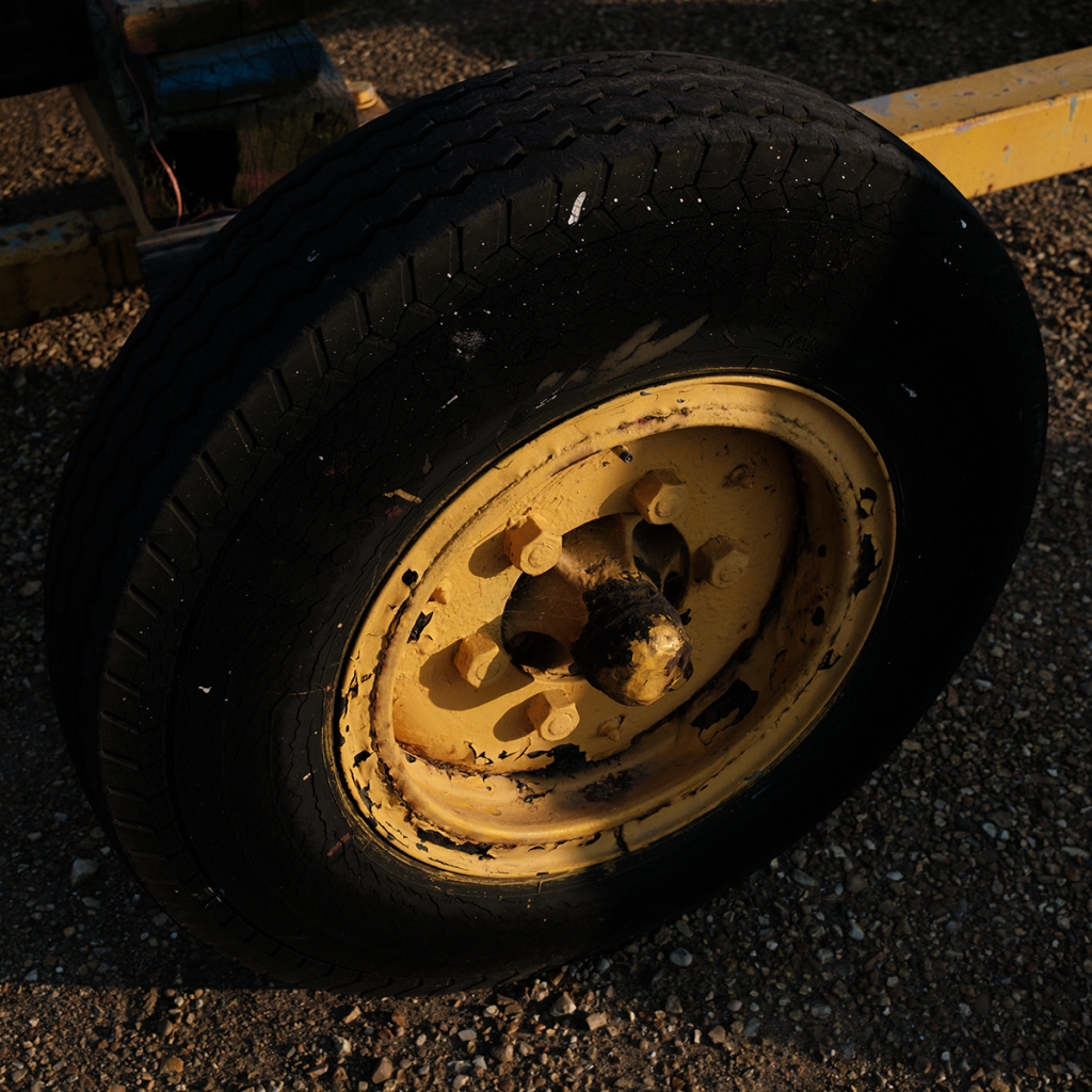
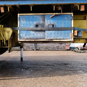
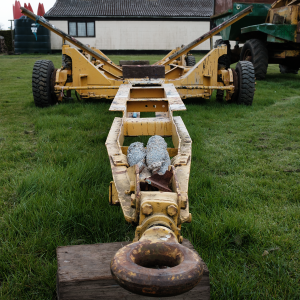
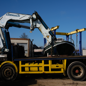
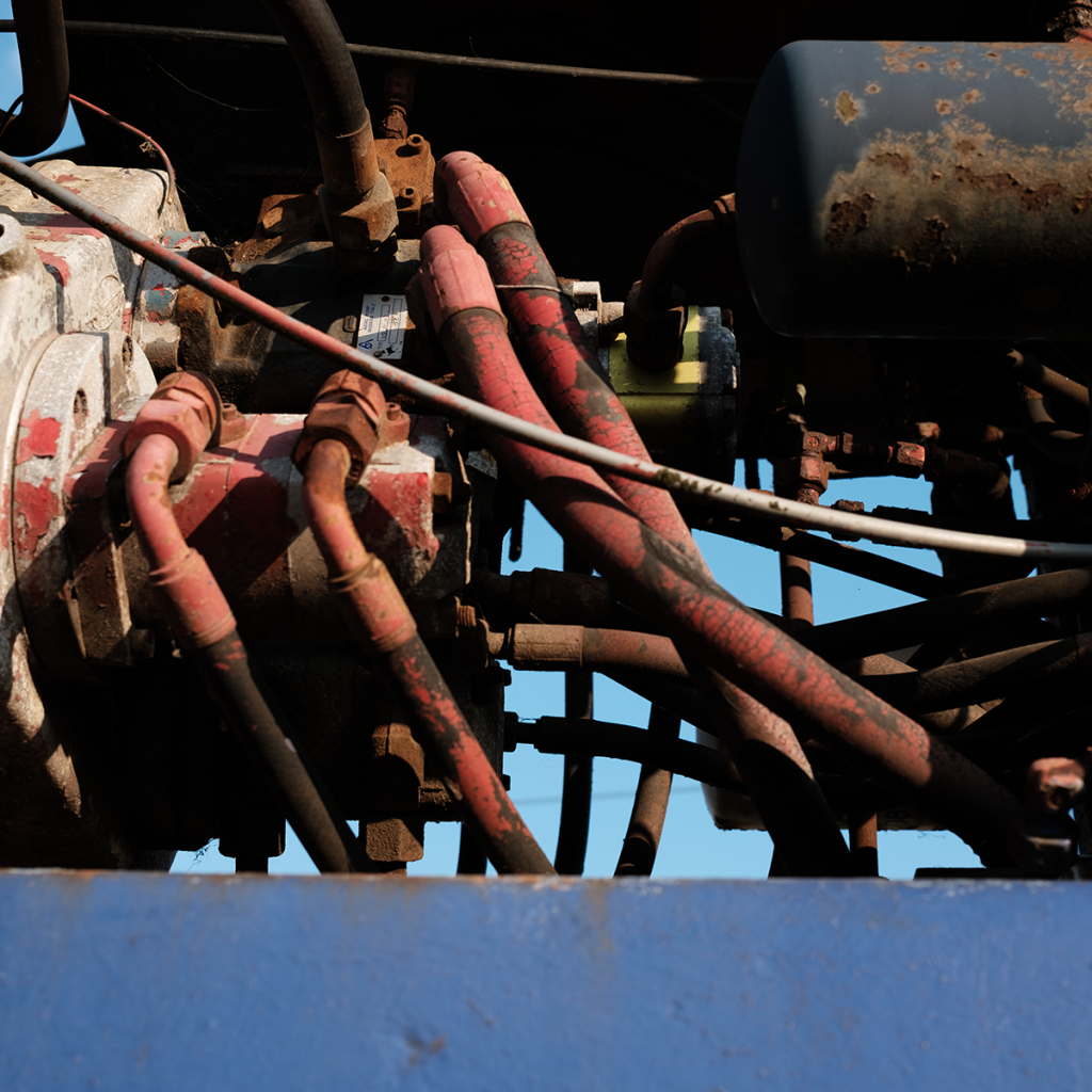
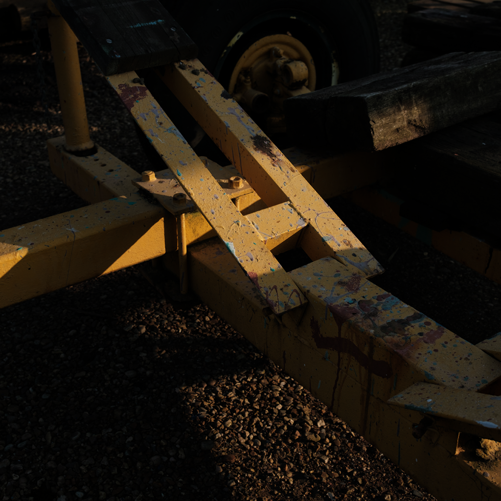
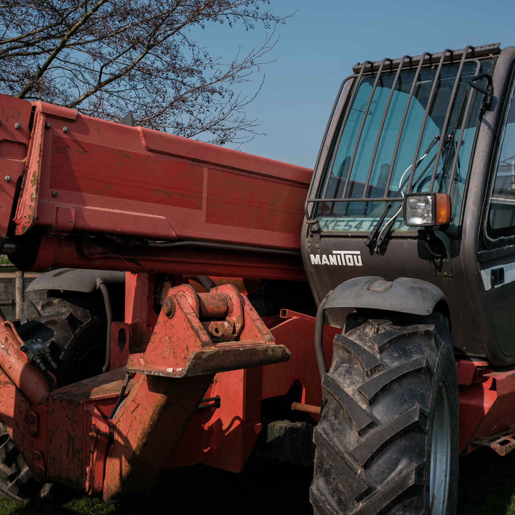
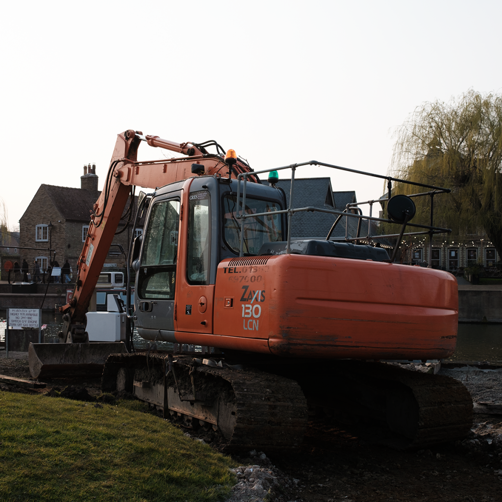
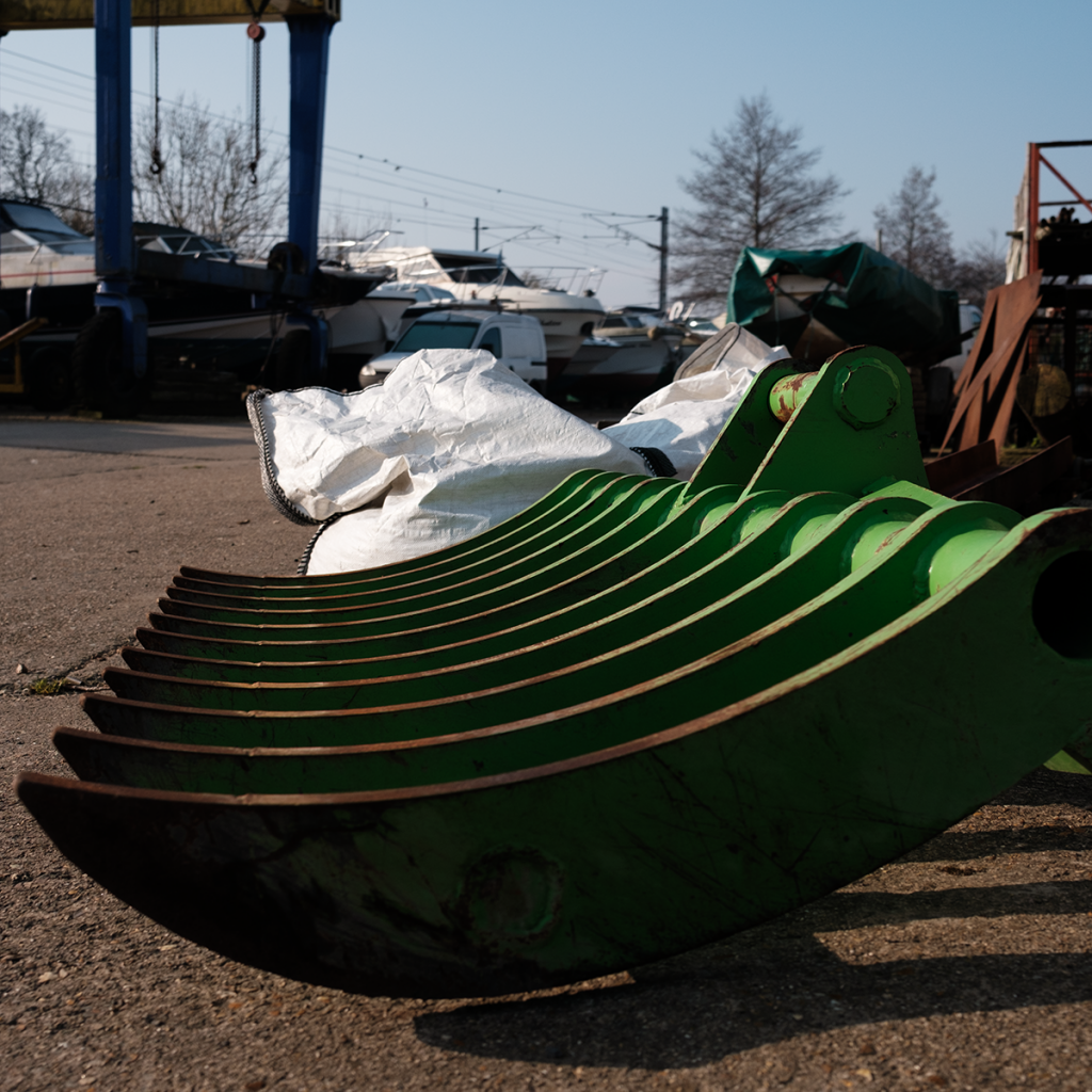
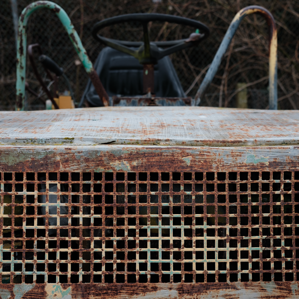
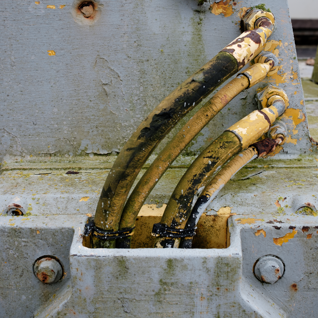
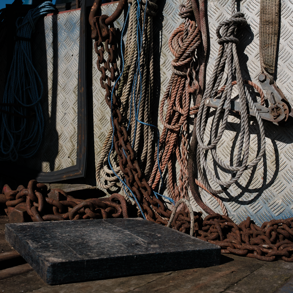
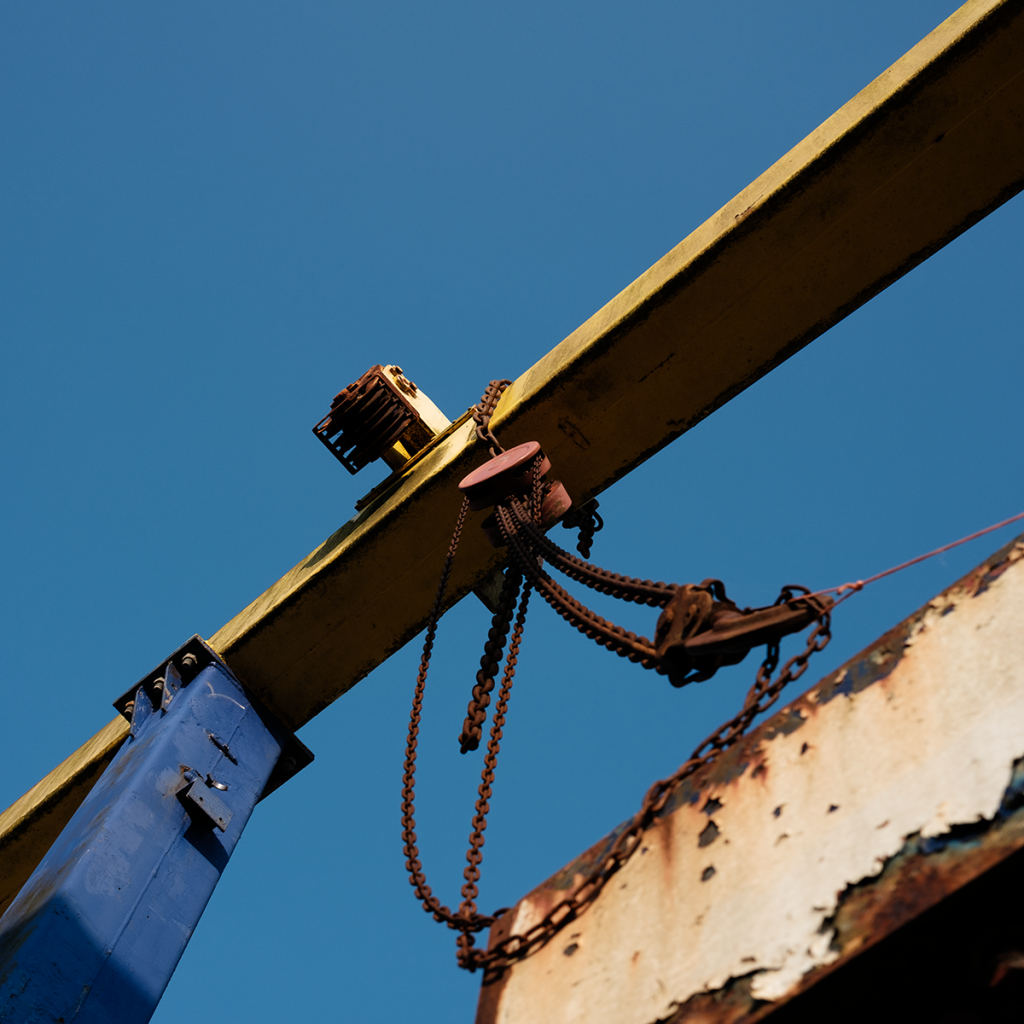
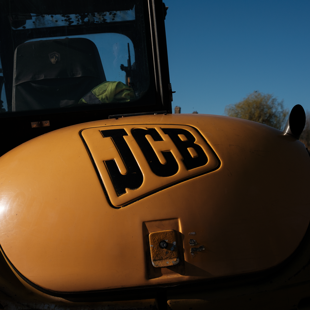
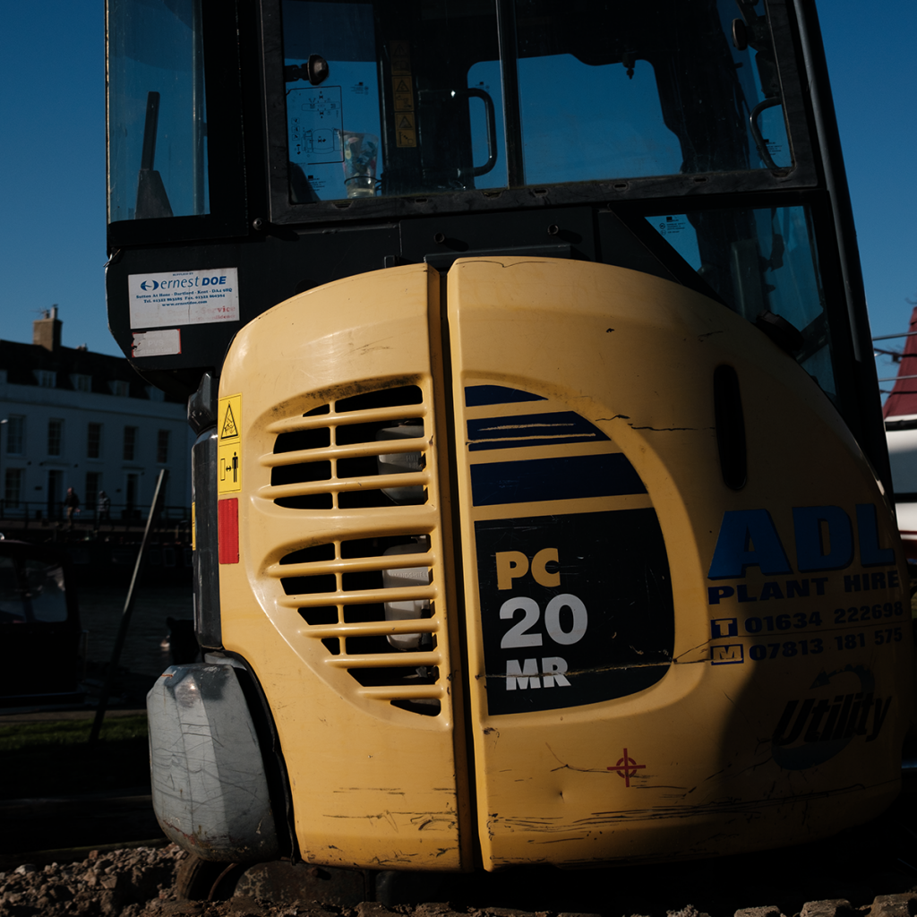
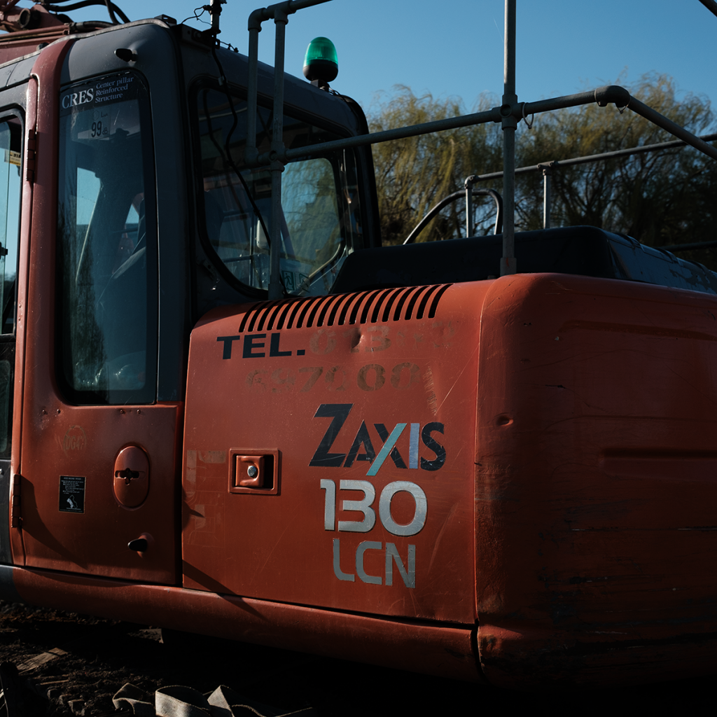
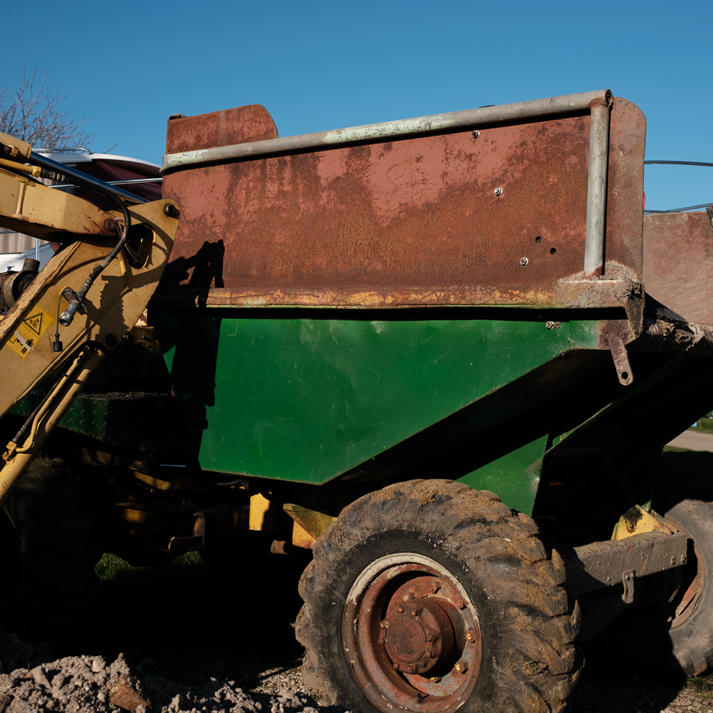
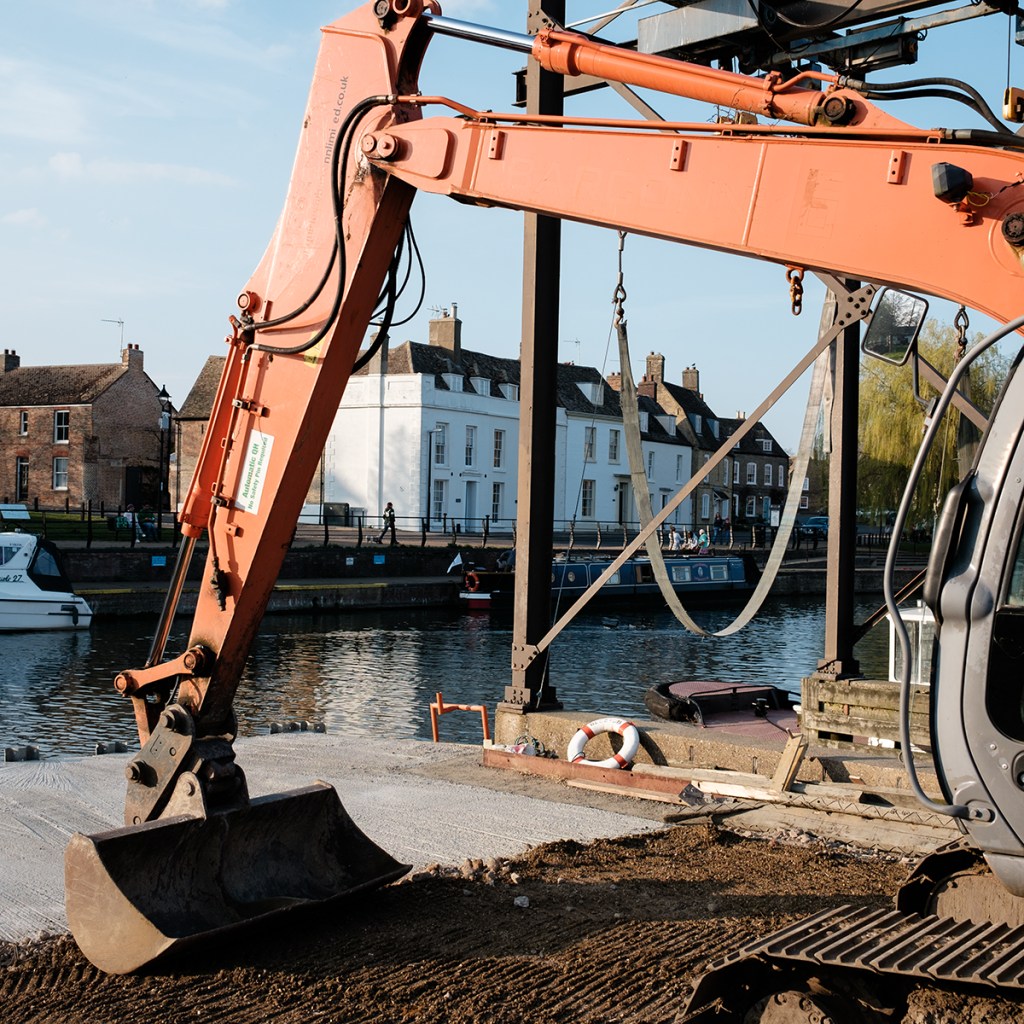
Living on a marina, I find there is always some form of work happening. It is usually heavy work. Things are being lifted, replaced or implemented all the time and one thing that strikes me is the colour of construction.
The various machines that rumble around are usually of striking colours. They demark their corporate lineage. The newer the machine, the brighter the colour, usually a bold, single one. Older items of machinery show the wear of time and the muting of colour. Paint has been scraped away sometimes revealing previous paints schemes. Other times, exposed metal has rusted. It is colour that dominates but shape comes a close second. The various shapes formed by arms of diggers are a bold example.
I also find the typography used in the logos a further point of interest.
My first look at construction started over on murpworkschrome.
I find this an interesting topic and the opportunity to be up close, when this subject matter is normally ‘behind bars’, literally, on a building site is too good to miss.
What follows is a start, with more to follow later…
The Colour of Construction – I posted my personal favourite images over on murpworkschrome.
Peace and photography
rp
OK, so I said in A New Beginning “…my iPhone 11 but I look to leave this behind and use the GR II exclusively.” but I thought I’d post this one last shot. Well two, actually.
The reason for this is that it is one of those shots where I can’t decide whether it should be in colour or monochrome. So I’m posting both – Street Lines in the Wet
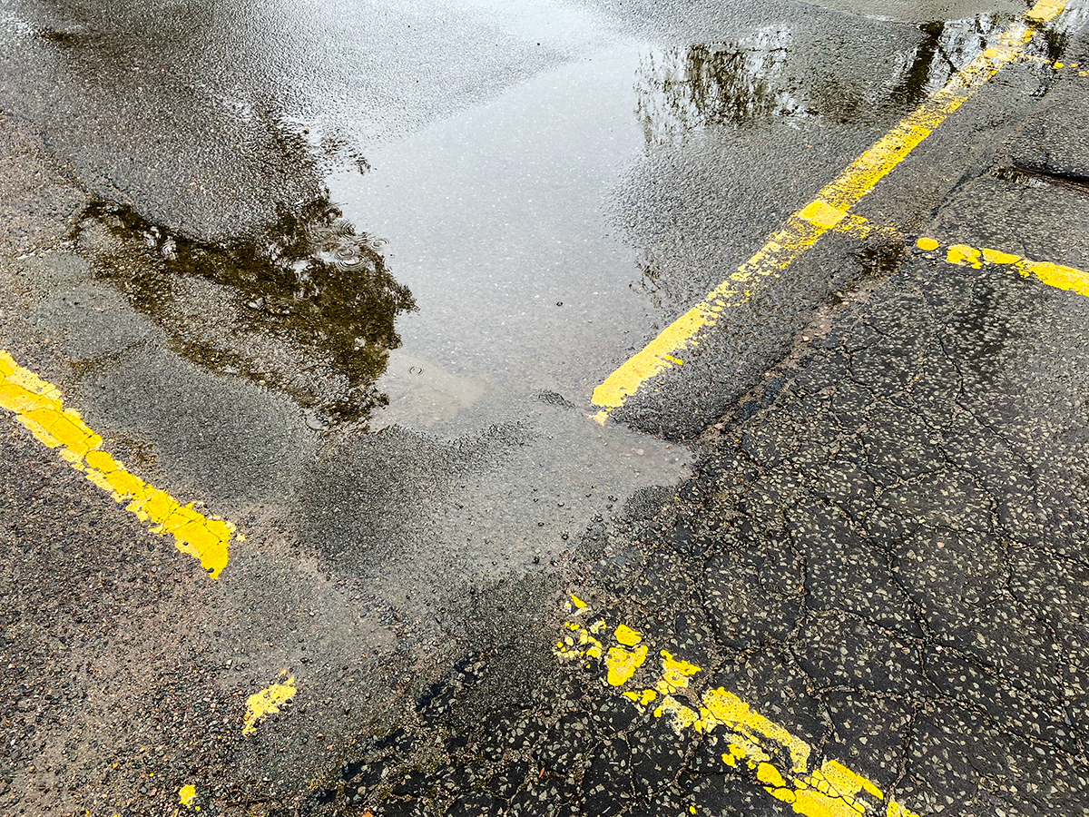
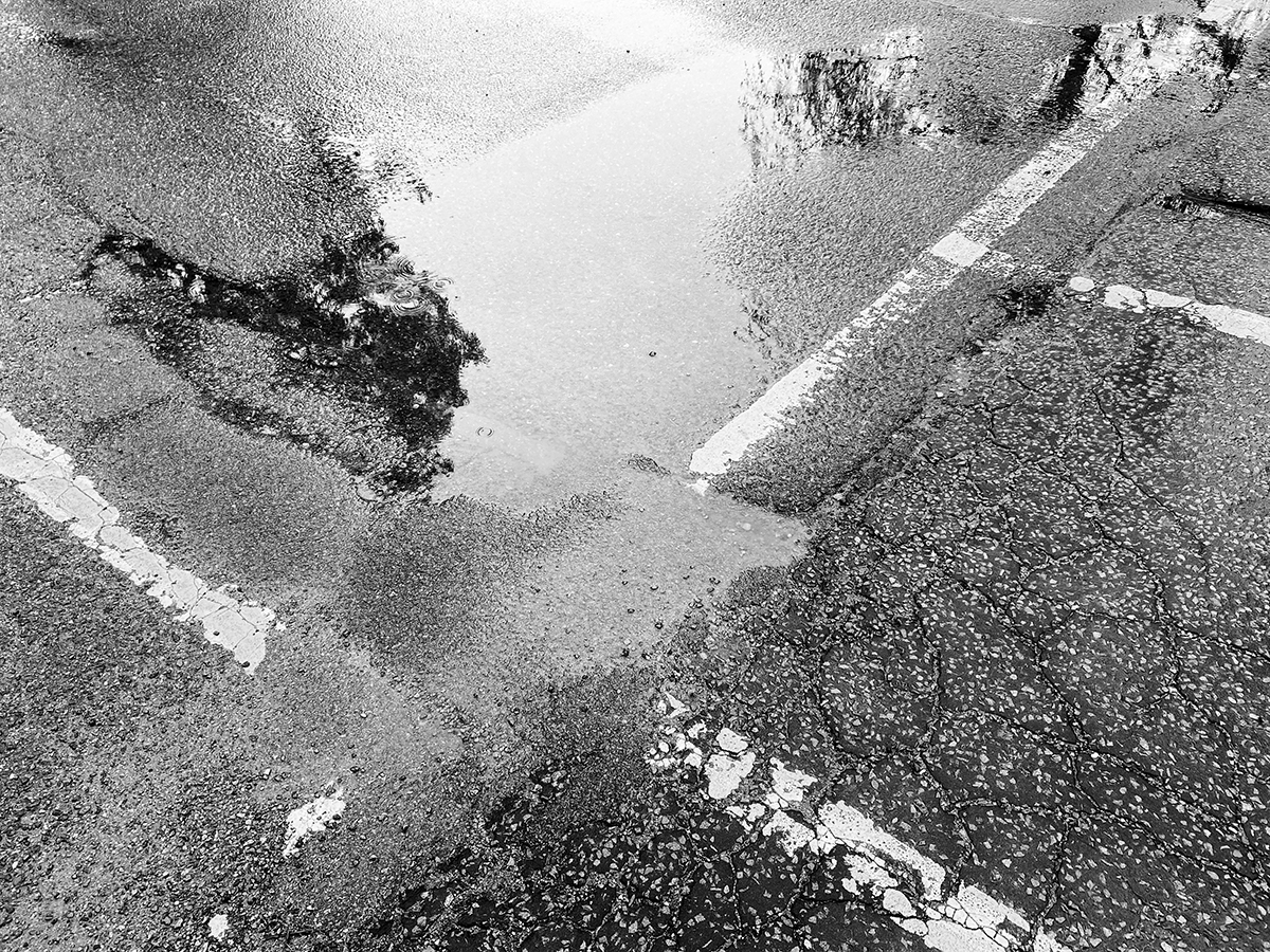
The colour image carries important information as it shows the yellow of the line marking and immediately triggers a recognition. The black and white image gives a graphically strong message. The lines being white could work as white lines are used in this context. So, although not conveying the same information as the colour image, it works visually.
I can’t decide between the two. A dilemma for One last 11 Shot.
Peace and photography
rp